The average conversion rate of an eCommerce website is 2.86%, with a global conversion rate of 4.31%. This means you can get 2 to 3 customers from a hundred visitors. When attracting leads, you need to make sure that your leads are converted into sales. Otherwise, you’re dealing with a lot of work that doesn’t bring any profit. So, how to convert traffic into sales? We’ve compiled a list of ways to start converting more customers with the traffic you’re already driving to your website.
Before you start
Before you start improving your website, it’s always good to know what’s your starting point. So, here’s what you can do before changing anything:
Audit your site.
Getting data about what happens on your site will help you with the optimization process and let you make data-driven decisions. Here are some data points to look for:
- traffic sources
- bounce and abandonment rates
- campaign click-through rates
- average order values
You can use the information to complete your buyer persona so that you can hone your offer.
Map your customers’ steps to the purchase.
Of course, you can’t predict what happens in every situation, but it’s useful to have some steps mapped for your customers. Especially if you connect them to the data you get.
Set your expectations.
Before optimizing your website, start with setting website goals to see what you’ll be optimizing for. You can select any actions visitors take on your site that bring some value to your business, such as:
- form submissions
- clicking links and buttons
- subscriptions
- custom conversions
Check what your competitors are doing.
To create a compelling offer, you need to know what sets you apart. Your site’s visitors will likely see them as well, so you need to make it clear how you match up to them.
Now that you know what needs fixing let’s get to work. We’ve compiled a list of easy fixes that can be used to increase your conversion rate.
Tips on turning your prospects into customers
Optimize your site experience
A fast and straightforward website is a must for any business. You have less than a second to impress your website visitors with your style, but it goes deeper than just creating a pretty website. Per psychological research, people determined whether a website was trustworthy based on the design and structure.
Here are some ideas on creating a more streamlined experience:
- To track how people interact with your site, employ tools that create heat maps of your site so that you can see where users have issues. Instruments like Crazyegg or VWO will show you areas for improvement.
- Make sure your website meets the expectations. The first thing your visitors will see even before they land on your website is your meta description in search results or your ad description. When they get to your page, it should deliver what the user thinks they are getting. For example, if you promise a how-to, don’t bring visitors to an editorial or your product page.
- Get rid of friction on your customer’s path. For example, if you have a long form that asks a customer in-depth questions only to get an email, try shortening it and see if people become less hesitant to complete it.
- Keep your site design simple and make sure it leads the client to his destination. You know your product, so all these steps might seem irrelevant to you, but your customer will see it for the first time, and unless you sell defibrillators, it might not be a purchase he desperately needs to make. If they meet a hurdle, chances are they’ll leave. Think of the airports when you work on the mix of your design and copy, how they have very clear directions repeated multiple times so that people definitely find their gate.
Get the right kind of traffic
To make sure you get more interested visitors to your website, start with an SEO audit, especially if you rely on organic search to drive traffic to your website. For example, check if your website’s targeting the wrong keywords. These are keywords that are irrelevant to what you do, too generic, or don’t include buying keywords.
Another step is to make sure you’re targeting the right social platforms. If you sell a company solution for business processes, you can skip having an Instagram account.
Make Your Site Trustworthy
To make your site more trustworthy, you need to convince your potential customers that your service is straightforward and that they’re not your first customers. Here are some tips to make your website more trustworthy:
- make sure it handles data via HTTPS
- consider offering a money-back guarantee
- update your blog regularly so that users don’t see a blog page that hasn’t been updated in a year and start wondering if you still work
- check all your links to make sure they lead exactly where you want them to; broken links create a bad user experience
- update your website and social media content
- make your shipping information clear, as about a third of customers will leave the website because unexpected shipping cost comes up
- add multimedia elements so that customers can see your product or study graphs to see the results
- include your clients’ logos
- offer money-back guarantee
Money-back guarantee pretty much says, ‘We know what we offer is really good,’ and that’s quite an attractive level of confidence. It also helps build trust with your customers, even if they buy from you for the first time.
What Makes You Better Than Competitors?
People don’t buy on the first website they stumbled upon. Research your competitors to find out what helps you stand out. Is your service cheaper? Or maybe you’re proud you only use ethically sourced materials. Make sure to get this point across as soon as possible so that a customer, who’s doing their research, can make an informed decision.
Segment Your Audience
Audience segmentation can lead to higher engagement and a better overall experience for your website visitors.
You can segment your visitors based on multiple factors, like language, location, first-time or returning visits, UTM parameters, or device. There are tools for segmentation and dynamic content like Omniconvert or VWO. In addition to segmenting your visitors, you’ll be able to provide customized content, A/B test elements, copy, or CTAs.
Optimize Your Sales Funnel
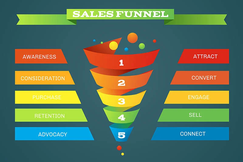
Before optimizing your funnel, check that you set up a conversion goal funnel in Google Analytics to gauge what’s happening. For example, in eCommerce, the most typical stage where customers drop off is a cart — about 70% abandon their cart. So if you direct most efforts there, your conversion rate will improve. To determine where your customers drop off, you need to know how you lead your customers to the conversion and compare where you lose most visitors. Or you can create more educational content. According to the Conductor’s research, it will make people 131% more likely to buy from you.
Take Reviews Seriously
Reviews are a way to help your potential customers make a decision and make your offer look more trustworthy. 88% of customers would trust reviews as much as a personal recommendation. Encourage customers to leave reviews on Google, Facebook, Yelp, or Amazon.
However, note that some platforms frown upon businesses asking for reviews. For example, Yelp explicitly states that “businesses should not ask for Yelp reviews,” and Amazon has recently forbidden offering discounts to get a review. Make sure to state your request neutrally, something along the lines of ‘check us out on Yelp.’ Additionally, you can link to a directory page where your customers leave reviews. Make sure to respond to negative reviews as soon as possible, as 53% of customers expect companies to provide an answer within a week, which links to having a positive reputation.
Display Testimonials
Testimonials are different from reviews, as they usually provide a more detailed description and are provided directly to you instead of a third-party platform like Yelp.
Here are some tips on where you can use testimonials:
- on a dedicated page where you drive your potential customers, such as a product page or landing page, to provide more information and convince them to make a purchase.
- in your abandoned cart email funnel or sequence to convince users to buy a subscription after the trial.
- If your customers submit video testimonials, you can include them in your video ads to promote your store. You can also leverage testimonials as YouTube ads, as 73% of Americans use YouTube, so you can make your video ads even more convincing.
Use your copy to showcase your benefits
Writing a convincing sales copy might be harder than you think, especially if you’re stuck with viewing the product from the inside. Turn to the customer’s view of the product, and stress the benefits of your offer, what it helps with, instead of just listing the features.
While working on the copy, you can clarify your company’s value proposition. Make sure your unique selling point is repeated several times throughout the website and comes across your images, headlines, and copy. Marketing experiments prove that unique selling points summarized in 10 words or fewer work best.
Your copy should address your target customer, their pain points, and motivations. Help them imagine how their lives will change once they use your product. You don’t have to start with the problems it solves. You can also show how it can make their great life even better.
Amp up your CTA buttons
CTA stands for call-to-action, so your buttons should work seamlessly with your copy. The CTA can call to pretty much anything, such as download your content, share a quote on social media or buy a subscription. Instead of just using generic CTAs like ‘Subscribe,’ you can turn them into statements such as ‘Yes, I want a discount!’ to make them more engaging.
Your CTAs should be consistent. For example, you can have multiple CTA buttons on the page, but they all should lead to the same offer to avoid confusing your website visitors.
Be Strategic with Your CTA Placement
Not only should your CTA be convincing, but it also shouldn’t be easily overlooked, so pay attention to where you place your calls to action.
You should definitely place your CTA above the fold. However, these days over half of the mobile traffic comes from mobile devices, which means your first screen can be scrolled through automatically. You can also include your CTA buttons in the navigation bar or within blog posts. The rule of thumb is that your site visitors should be able to access a button no matter where they are on your website.
Set up push notifications
Acquiring a new customer is 5x more expensive than retaining an old one. One way to retain your customers is to get them to return to your website. That’s where the push notifications service can be of help.
Push notifications will be delivered to desktop or mobile browsers, even if your subscribers have already switched to another website. What’s important, they have a simple subscription process, which can help you simplify your website experience, as you can maintain contact without asking for their email. It will also help you deliver content to customers wary of sharing their emails. You can use push notifications to notify your subscribers about new posts, offer discounts, remind them about a forgotten article or abandoned cart.
It’s not only about your homepage
Make sure your ads don’t direct users to your homepage. If you triggered their interest by showing your product, don’t make them search for it, direct them to a product page or a landing page with a clear offer.
Provide value upfront
There are some hurdles involved in website interactions. For example, a customer often needs to create an account, leave their email or download an app. To make it worth the effort, you can include some benefits for your customers, like free shipping, free trial, or discounts. You can also leverage lead magnets and offer your customers an ebook or a guide in exchange for their email addresses.
Product Recommendation Is a Must
Product recommendations are another thing that can be improved. According to Amazon, they make 35% of their sales thanks to recommendations. If you use a website builder, you can include a recommendations block based on:
- bought together
- best-selling
- recently viewed
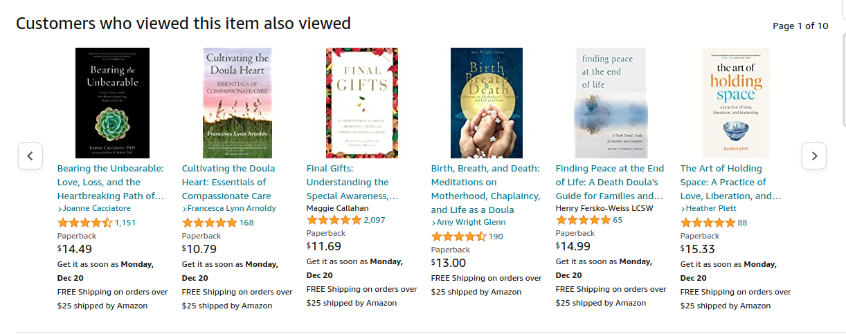 Recommendation based on similar items
Use winning interactive elements
Statista says people visit multiple pages in one buying session. An average buying person will look through 32 pages before finally making a purchase. 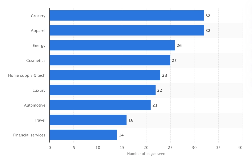
The number is significantly lower on websites with fewer options, but still, it looks that people need a nudge to make a purchase.
- pop-ups
However, some people do think they’re annoying, so instead of having it pop up as soon as a visitor arrives at your website, you can time it strategically:
- when they scroll down a certain portion of a page
- after they spent some time on the page
- after some time of inactivity
- when they hover over an element
Usually, you can also set your own custom trigger event.
- slide-ins
Slide-ins are pretty much a pop-up type, but instead of popping up, they come in sliding from the corner of the screen. Compared to pop-ups, they are less intrusive. You can use them to promote sales or offers.
- floating bars
Floating bars are stripes with an offer and a CTA button that appear across the top or bottom of a page. It can be a way of sharing your news, encouraging your visitors to visit your social media page, or capturing your visitor’s contact info.
- countdown timer
Timers create a sense of urgency, so your site visitors will be more likely to click that button if you add it to your offer. For example, here’s a CXL case of increasing conversion rate by 332%, combining a limited offer sign with a countdown timer.
- exit-intent pop-ups
Exit-intent pop-ups come in handy when it comes to capturing abandoning visitors. They are triggered to be shown before the user leaves the page. It’s a great way to reduce checkout abandonment, prompt users to reach out to you or ask them to take a survey.
- multi-step pop-ups
Multi-step pop-ups take your users through multiple steps before completing the action. Generally speaking, they leverage the Zeigarnic effect — people have to finish whatever they started.
Gamify Your Visitors’ Experience
Take your pop-ups a step further, and instead of just showing a pop-up with an image and some text, add a spin to it, well, literally. Add a spin-to-win pop-up to make getting a discount more fascinating and enhance your users’ experience. 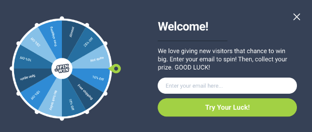
Provide answers asap
Live chats help provide a faster experience for your customers. Instead of filling in a form and waiting a few days to get their answer, they can get information instantly. It will save them from frustration and will improve your user engagement.
You can connect live chat solutions to the e-commerce platform you’re using. For example, there’s a number of plugins for WordPress and Shopify apps, like LiveChat.
Create an abandoned cart email sequence
People abandon carts all the time. However, if that happens, you still have a chance to save the day. All the people who haven’t finished their purchase are your potential customers. So, if that happens, they should receive an abandoned cart email or even several. In a typical sequence, you’ll remind them about the cart, send a follow-up email, and then offer a discount. Or, to keep such campaigns focused on your website, you can combine such campaigns with push notifications.
Learn about the benefits of push notifications
Try another offer
If you’ve optimized your copy, website, and customer experience, but conversions still don’t happen, you can tweak your offer. For example, Hubspot is nailing the provide value upfront idea. They have various tools, like the website grader we mentioned before, that will let you get actionable advice before you consider buying a subscription.
However, developing an extra solution isn’t something every company can afford. Consider offering something tangible that helps your customers solve their problems. Keep experimenting with your offer to find what resonates with your audience.
Don’t lose conversions on mobile website
The mobile version of your website is equally important, as about half of all the traffic happens through mobile devices.
How to stop losing conversions on mobile websites?
- Make sure your website is optimized for mobile. People get impatient to the point where a 1-second delay can result in a 7% conversions loss. You can test the speed with Google’s tool. If you have a WordPress website, you can use plugins to compress images and leverage caching so that your website loads faster.
- Check if your page is optimized for mobile with Google’s checker. The tool will provide you with recommendations on what can be improved.
- Implement a straightforward checkout process. If you don’t have a one-page checkout, a mobile version would be a place to have it.
- Eliminate distractions. You can adapt your website elements and even remove some to simplify your mobile experience.
- Localize your content so that it comes up in mobile searches, as 46% of all searches look for local information.
A/B Test Your Ideas
Every business is different, so chances are if you’re trying out ideas that worked for someone else, they won’t help to drive sales to your website. To find out what works in your niche and for your audience, you need to keep A/B testing your ideas. It can be as small as testing which subject line gets you a higher open rate or as big as trying out different landing pages. However, note that it’s easier to see what has an effect with smaller changes.
For example, with the headings, you can test such variables as:
- lengths
- use of numbers
- tone
Wrapping up
Increasing website conversion rate takes a lot of analysis and a lot of testing to see what works in your case. Here’s a rundown of ways to improve your conversions:
- Optimize your site experience.
- Make sure you’re getting the right kind of traffic.
- Make your site trustworthy.
- Show what sets you apart.
- Segment your audience.
- Optimize your sales funnel.
- Take reviews seriously.
- Display testimonials.
- Improve your copy.
- Work on your CTAs.
- Make sure your CTAs are in all the right places.
- Set up push notifications.
- Don’t drive people to your homepage.
- Offer freebies that add value.
- Gamify your users’ online experience.
- Include product recommendations.
- Use winning interactive elements.
- Provide answers asap.
- Offer a money-back guarantee.
- Create an abandoned cart email campaign.
- Find your perfect offer.
- Improve your site’s mobile version.
- Test everything.
FAQ
- How do I convert my website traffic into leads with push notifications?
Login to your Gravitec account. Set up your push notifications permission prompt to get subscriptions, and customize it to get even more opt-ins. Segment your subscribers using tags, location, browser, language, and device. Then, set up drip campaigns for each subscriber group based on their interests. Direct subscribers to web pages with the best conversion rate.
- How are leads converted into sales with push notifications?
Segment your subscribers based on which web page they subscribe to push notifications. Send them time-limited offers that fit their interest. If you’re running an online store, use abandoned cart reminders to boost conversions on the last stage of your sales funnel.


