Marketers still hope for people to read their emails, and not in vain: 59% name emails as their most significant source of ROI. Additionally, the number of email users is projected to reach 4.6 billion users in 2025.
So, how does one get a visitor’s email? How does one build an effective WordPress squeeze page? Is it the same as a landing page? You’re in the right place to find out. Let’s start with the definition.
What is a squeeze page?
A squeeze page is a type of landing page aimed at getting emails from prospective customers or subscribers.
What is the purpose of a squeeze page? The squeeze page has a single purpose — to get an email from a visitor. The name comes from the fact that there are no other ways to interact with the page; you need to either provide your email or get out.
For a user, it provides something valuable, like an email course or an e-book, typically called a lead magnet. For a marketer, it creates a chance to build relationships via email marketing and eventually bring the subscribers towards a purchase.
Once a visitor leaves an email, they’re transferred to a thank-you page. It should let them know that the content they subscribed for is already in their inbox, answers any questions they might have, or lets them know what the next steps are.
A squeeze page can be displayed as a pop-up, a content form, or even as a fully functioning landing page. So, how come we don’t just call it a landing page?
A squeeze page vs. a landing page
As we mentioned before, a squeeze page is a type of landing page. They also have a lot in common, like working for targeted campaigns, functioning around a single CTA, and having all the content on one page.
What is the difference between a squeeze page and a landing page? A landing page can have more than one objective, like offering a free trial, and it has more content. A squeeze page consists of a headline, short text, and one or two fields for input.
| A Squeeze Page | A Landing Page |
| Has 1 or 2 fields for email and name. | May include multiple form fields. |
| Is very short. | The length can vary. |
| Always uses forms. | Can use only buttons. |
| Typically used at the entry point of the buyer’s journey. | Can be used at any stage of the buyer’s journey. |
| Doesn’t have a navigation bar. | Can have a navigation bar, multiple links, and images. |
What makes a good squeeze page?
Convincing headline
Your headline doesn’t need to be catchy, but it should convey the outcome as clearly as possible. Let your potential subscribers know what they will get in exchange for their contact. For example, if you have a blog on coffee, your headline for a squeeze page could be Learn How to Make Bumble Coffee in Five Minutes. State the problem clearly and provide a solution — your free product.
It makes sense to leave your email
Don’t ask for an email to provide something that’s not necessary to send. For example, if you offer a video available on YouTube, asking for an email will look scammy. However, if you send a bite-size course, an e-book, or a PDF report asking for email makes sense.
Great offer
People are wary of spam these days, so they don’t leave their emails easily. Craft an offer that’s hard to resist. For example, you can go to a website with courses like Udemy and check what courses people are willing to pay for. Once you open the course outline, you’ll see topics covered. You can create PDFs covering the same topics to offer your subscribers or even make an email course teaching people how to track events properly.
For example, say you run a blog on marketing. Find a relevant topic on Udemy, like this Google Analytics course. Providing in-depth tutorials on Google Analytics could get you emails from your visitors.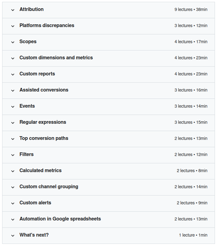
Another way to find something to offer your subscribers is to visit groups and forums and check what people are asking about. Just look for themes that come up over and over.
No distractions
The sole purpose of the squeeze page is to get you that email. If your visitors can see your website’s navigation or click a link and leave to another page, that’s just too distracting. Let them focus on your offer.
Other people like it
Implement social proof. Include short testimonials to show that your content has already helped someone.
Fast delivery
Once your visitors provide you with an email, deliver on your promises. Send your content or the first email of the series. Sharing their information and not getting content until later creates a bad user experience.
It’s optimized for mobile
Over 90% of the internet population use mobile phones to go online, so if your website isn’t optimized for phones and tablets, it’ll be harder for your users to interact with your content.
Do squeeze pages work?
To learn if your squeeze page is working, you need to learn its conversion rate. According to GetResponse’s Benchmark report, the average conversion rate of a landing page across industries is 3.62%. However, they do vary in different industries, from 6.67% in Sports & Activities to 0.99% in Agencies.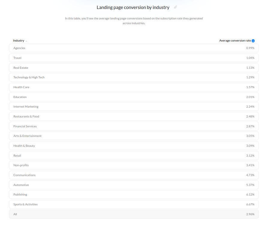
Multiple factors can influence your conversions, like
- The speed of your squeeze page
- The value of your offer
- Design
- Tactics you’re using to drive traffic (organic vs. paid)
- Type and size of your audience
- Your market (level of competition)
The same squeeze page can have different conversions on different audiences and benefit from minor tweaks, so use A/B testing on top of the funnel strategy to find out what works.
To gather analytical data on your squeeze page, you can use:
- Google Analytics to see where people come from and how they’re behaving.
- Google Tag Manager to track events, e.g., when someone clicks on a link or scrolls to a specific part of the page.
- CrazyEgg to create heatmaps of your website and to see what’s working.
- Facebook Pixel to show your ad to those who visited your page but didn’t convert.
You can also use WordPress plugins like MonsterInsights to connect your Google Analytics.
Drive conversions with marketing plugins
How to create a squeeze page
Now that we’ve learned what a squeeze page is, you might be wondering how to create one for your WordPress site. There are two main ways on how to build a squeeze page. You can either code one from scratch or use a WordPress page builder.
Get your plugin or theme
Using WordPress themes or plugins lets you create a squeeze page in a matter of minutes. They won’t be completely customizable, though.
 SeedProd is a landing page builder for any WordPress theme. It also has squeeze pages templates. It uses a drag and drop interface, so you can set up your squeeze page and thank you page in minutes. All it takes is choosing the template, adding your copy and image, and editing your SEO settings. Alternatively, you can customize the look of the template and even edit custom code.
You’ll also be able to connect popular email marketing services to your form to automate email sending.
Pricing: from $39.50 per year.
 Beaver Builder is a page builder for WordPress that will let you create a squeeze page by editing templates. It will work with any top WordPress theme. You can add all the essential elements like forms, headings, images, and videos.
Pricing: from $99 a year.
 OptinMonster lets you create responsive squeeze pages with a drag-and-drop builder. You can change the page’s layout, change the font and use extensive rule sets that let you set a trigger for your squeeze page. You can either edit their templates or start with a blank canvas without coding. You’ll also craft the message for a thank-you page. OptinMonster supports integration with email providers and Google Analytics.
Pricing: from $9 a month (billed annually).
Checklist for building a squeeze page
- A relevant headline that states what your subscribers will get.
- An image of what you’re offering. It could be your photo if you’re offering to subscribe to your newsletter or an image that represents the idea of a course. It should match your overall stylistics.
- A brief description of the benefits your subscribers will get or of the solutions to their problem.
- A form for email. You can also add a field for a name.
- A CTA button that has an imperative of the action you’re expecting.
- Testimonials.
- A thank-you page.
Creating a successful squeeze page doesn’t always happen on the first try. Do A\B testing to see what appeals to your audience, test images, CTAs, or headlines.
How to drive traffic to squeeze page
- Choose the right target audience
Go deeper than age and gender, work with your audience’s pains and goals to create compelling copy. Get all the available information from your customer profile. This way, you’ll craft an offer that will pull the right audience. Email Mastery calls this idea a message audience fit, meaning your offer needs to fit the audience you aim to attract.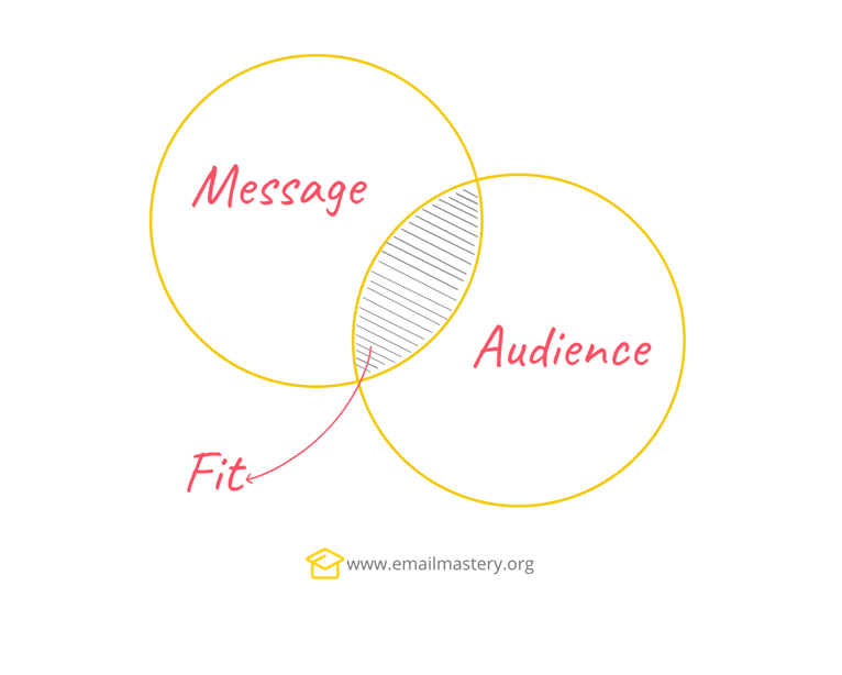
Ask yourself what your target customers are struggling with and how you can help them. Once you know what immediate problem you are trying to solve, you’ll be able to create a compelling offer. For example, if your customers are concerned about keeping fit, and their main issue is a lack of time, you can offer a free meal plan that takes only 20 mins a day to prepare.
- Don’t ignore SEO
Of course, there are not too many opportunities for SEO on your squeeze page, and your website would be more responsible for your organic traffic. But you can include keywords into the page’s title tag. If you choose some low-competition keywords, your squeeze page can actually rank for them.
- Push notifications
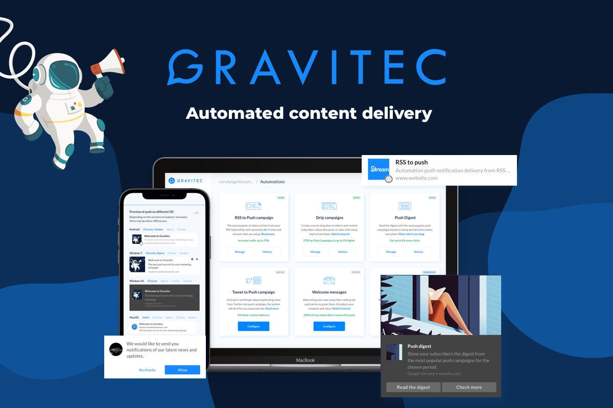
Push notifications will give you another shot at engaging your visitors and turning them into subscribers. You don’t need to choose between email marketing and push notifications — they complement each other. You can set up a push notifications drip campaign to support your newsletter or online course and drive your subscribers towards a purchase. If you’re just gathering emails to create a fan base for your blog, you could send weekly push digests with your best posts.
Push Notification Examples and Use Cases
- Pay for your ads
In addition to driving organic traffic to your page, you can also get ads on Facebook to drive people to your website. And while organic traffic gets you more stable results, ads will help you drive people from the very beginning once you rank on Google. That’s where you use your ideal customer when you target your ad.
Squeeze page design styles
The squeeze page has a simple structure; however, it can provide different user experiences. Let’s take a look at the most popular squeeze page templates.
Pop-Up Squeeze page
Are you familiar with the experience of scrolling through an article, and then a pop-up comes up offering you to subscribe? That’s a pop-up squeeze page. The user will have to click X or a link to close the page to get back to reading.
Some readers find pop-ups annoying, so make it short and to the point. Make it easy to see how to close the page and think your copy through. If the reader finds your offer interesting, they won’t be annoyed at blocking the content.
Here’s an example of a pop-up squeeze page from Blogging Wizard. 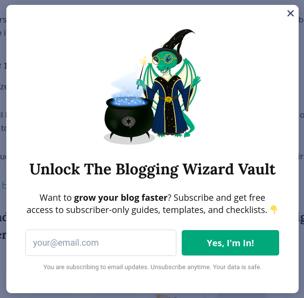
Splash Page
A splash page is a type of squeeze page. You can recognize it by not being able to interact with the website while a splash page is active. You usually get to it once you click a link on social media and get to the website or click the content link. It doesn’t always share the goal of capturing an email. It can ask a user for their age, present an ad or share an announcement such as “We’ve just created a new course on haute cuisine!”
Here’s an example of a splash page by OptinMonster. It blocks the article till you decide to close it. You can’t see navigation anymore, so you have to read what they have to offer.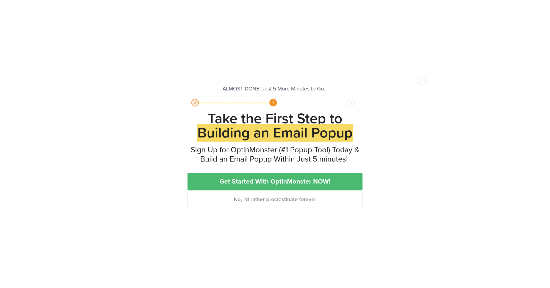
Squeeze page examples
Here are the best squeeze pages to drive inspiration from.
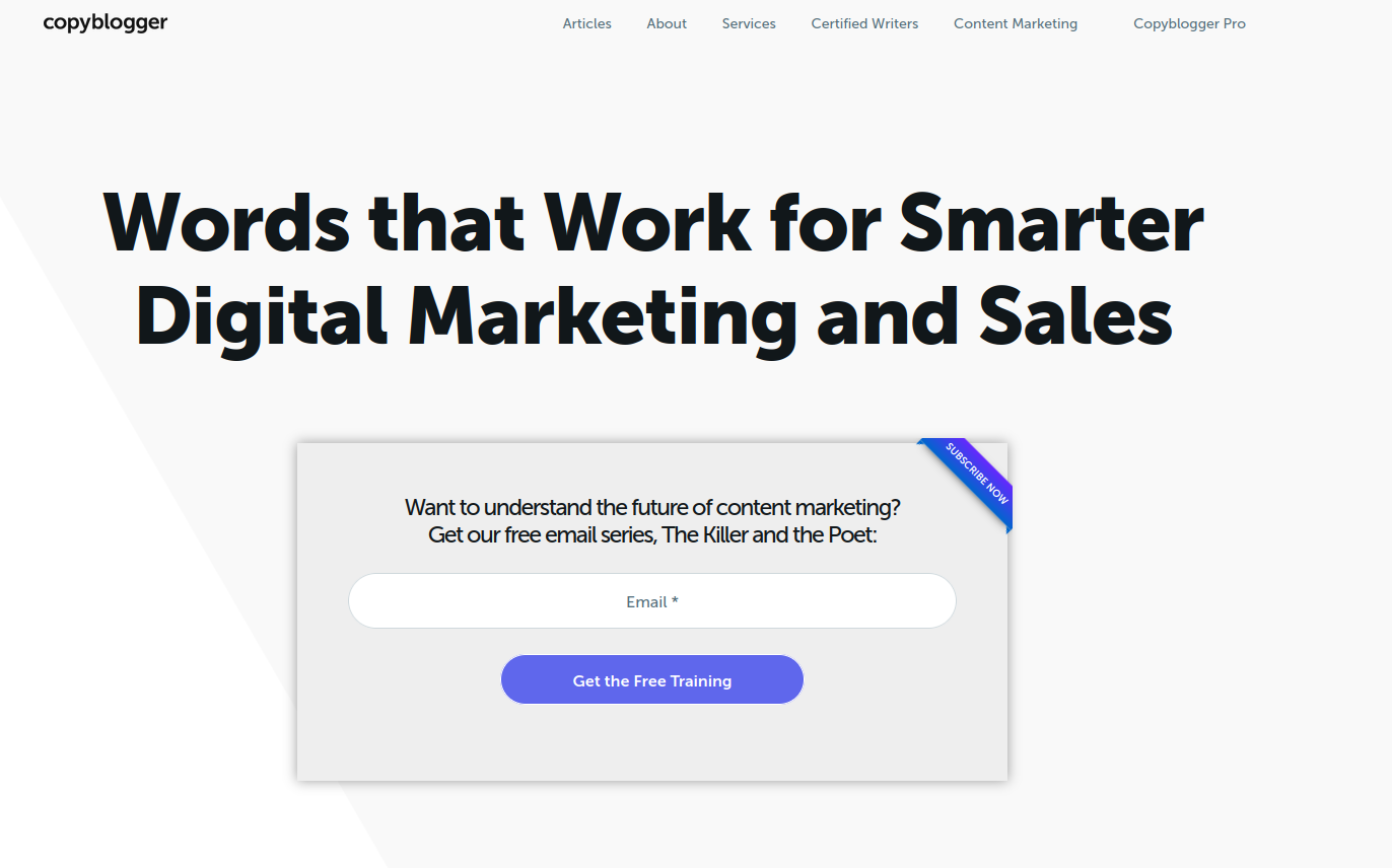
- Copyblogger clearly states the outcome of the squeeze page, has only one field to enter the email, and has a very minimalistic design with a clear focus on the form.

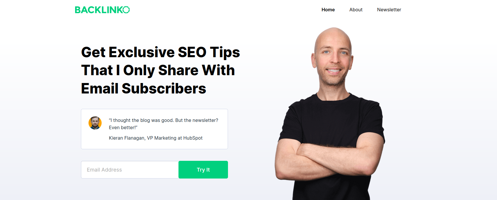
- Backlinko blog uses a squeeze page as the home page. Its content offer comes with a personal brand and years of experience in SEO, so it’s hard to resist. The author also includes testimonials of people enjoying his newsletter.

- GQ leveraged a recognizable photo of Timothée Chalamet, associating the magazine with celebrities, which works as social proof.

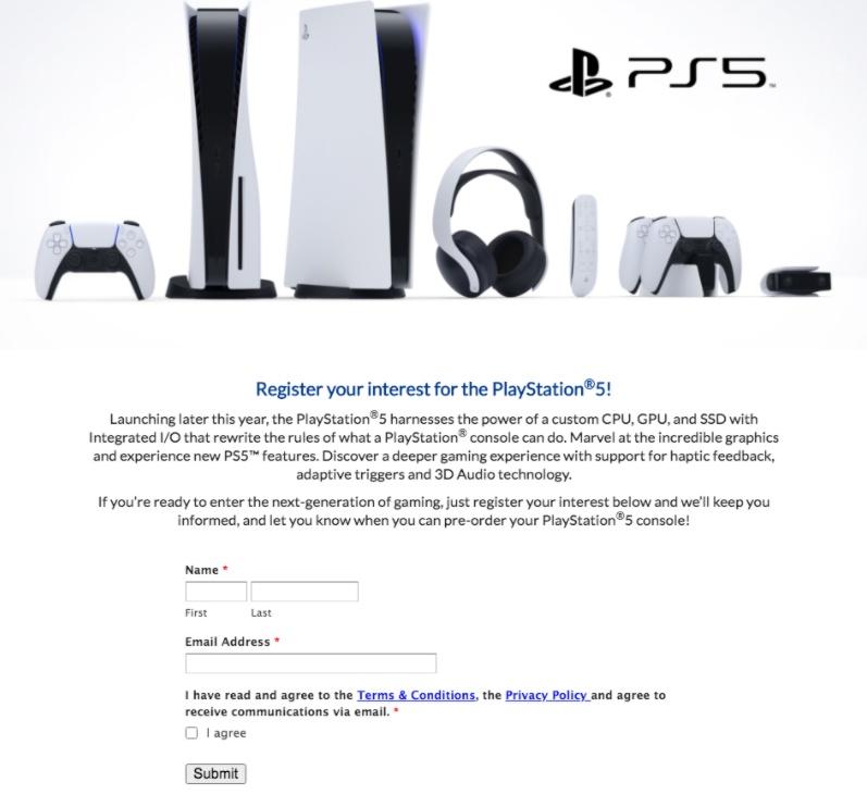
- Sony PlayStation 5 might not have been the most successful launch of Sony, but they definitely created quite a buzz. Before it came out, Sony offered people to ‘register their interest’ with a squeeze page. They clearly state the benefits of the console and showcase their product with great images. They also ask users to agree to terms before subscribing.

- OptinMonster offers strategies to reduce cart abandonment, providing a clear incentive with statistics all too familiar to anyone in e-commerce. Instead of just adding an X to close the squeeze page, they also included a button to close it. Notice also that the page is mirroring the brand’s colors.

- Digital Marketer in the newsletter squeeze page includes social proof, uses numbers in the headline, and throws in a bonus for subscribers.

- Marie Forleo uses a Get started page as a squeeze page on her website. She offers audio training in exchange for an email address using attractive design and clear copy.

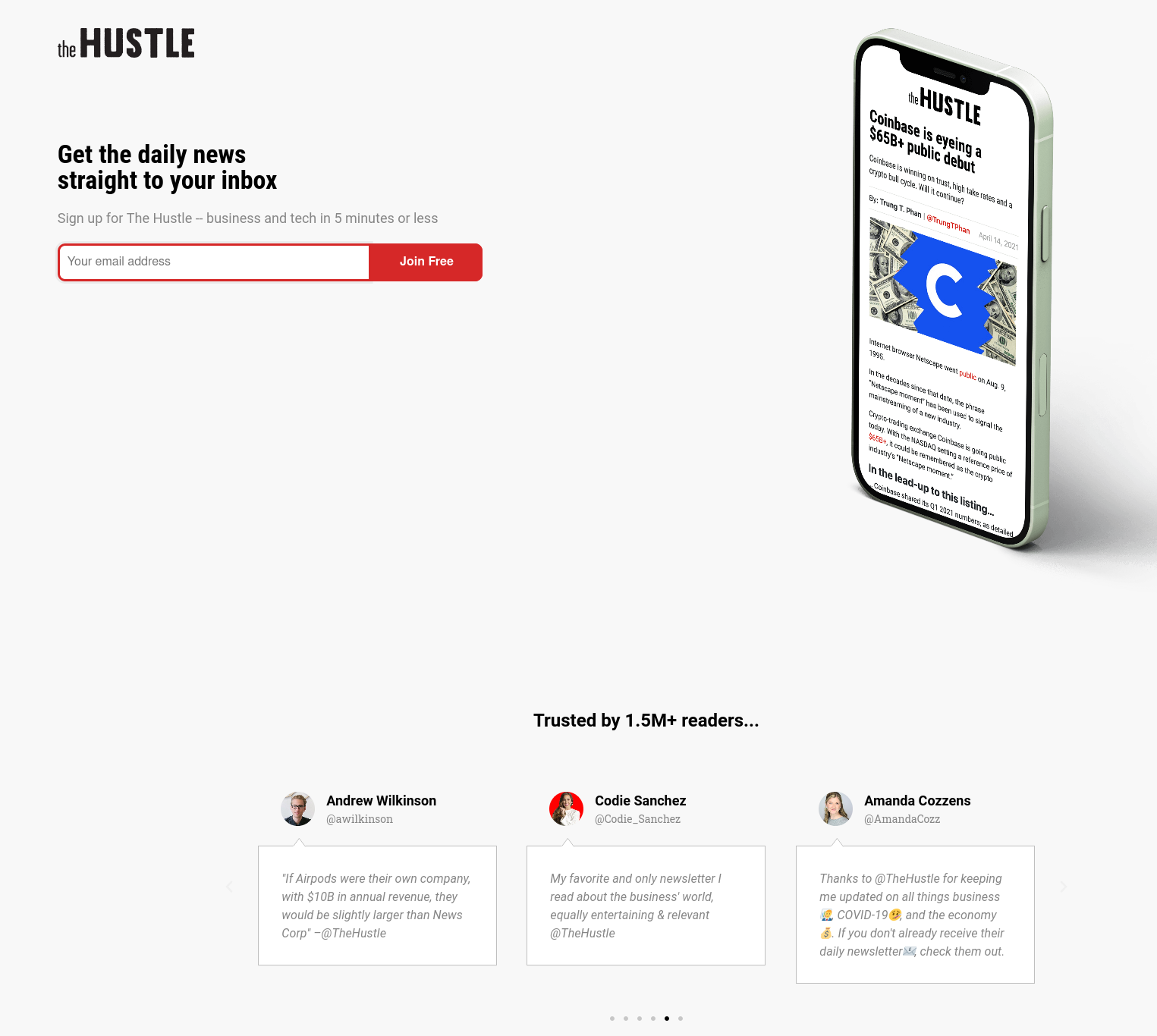
- Hustle offers a newsletter without sharing other content online, which creates an air of exclusivity. You can also see social proof at the bottom of the squeeze page. They’re not afraid to leave a lot of space and also provide no other incentives, so it’s either subscribe or never learn what we’re sharing.

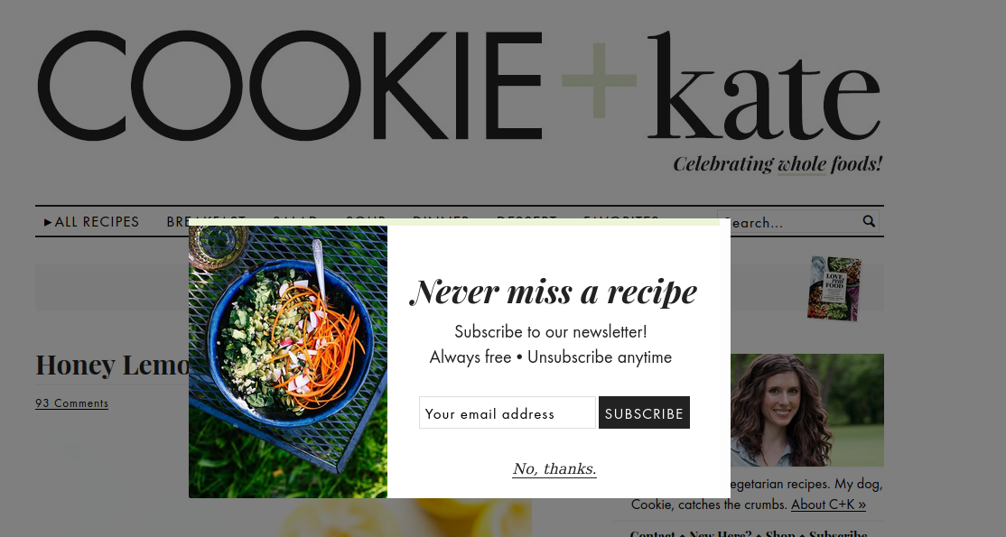
- Cookie + Kate offers to subscribe to their newsletter in an undemanding way, reminding there’s always the option to unsubscribe. They use a great photo to inspire subscribers to try and cook something and provide an easy option to refuse. They might have made a button a different color so that it doesn’t match the color of the text.

Summary
Whatever type of squeeze page you chose, they’ll be an excellent add-on for your WordPress website and help you build your email list. Email marketing is still a viable strategy to build relationships with your readers and promote your products or services.
While creating a squeeze page, you should keep it short, write a clear copy that shares the value of your offer and provide your prospects with content they’ll be willing to leave their email for. In addition to creating a squeeze page, you can use paid ads to drive traffic, web push notifications to remind them of your best posts, and SEO to drive organic traffic.


![How to Create a Squeeze Page on WordPress and Drive Traffic to it [+Real-life Examples] photo](https://gravitec.net/blog/wp-content/uploads/2021/07/image5-1.jpg)
